Elektra Invest
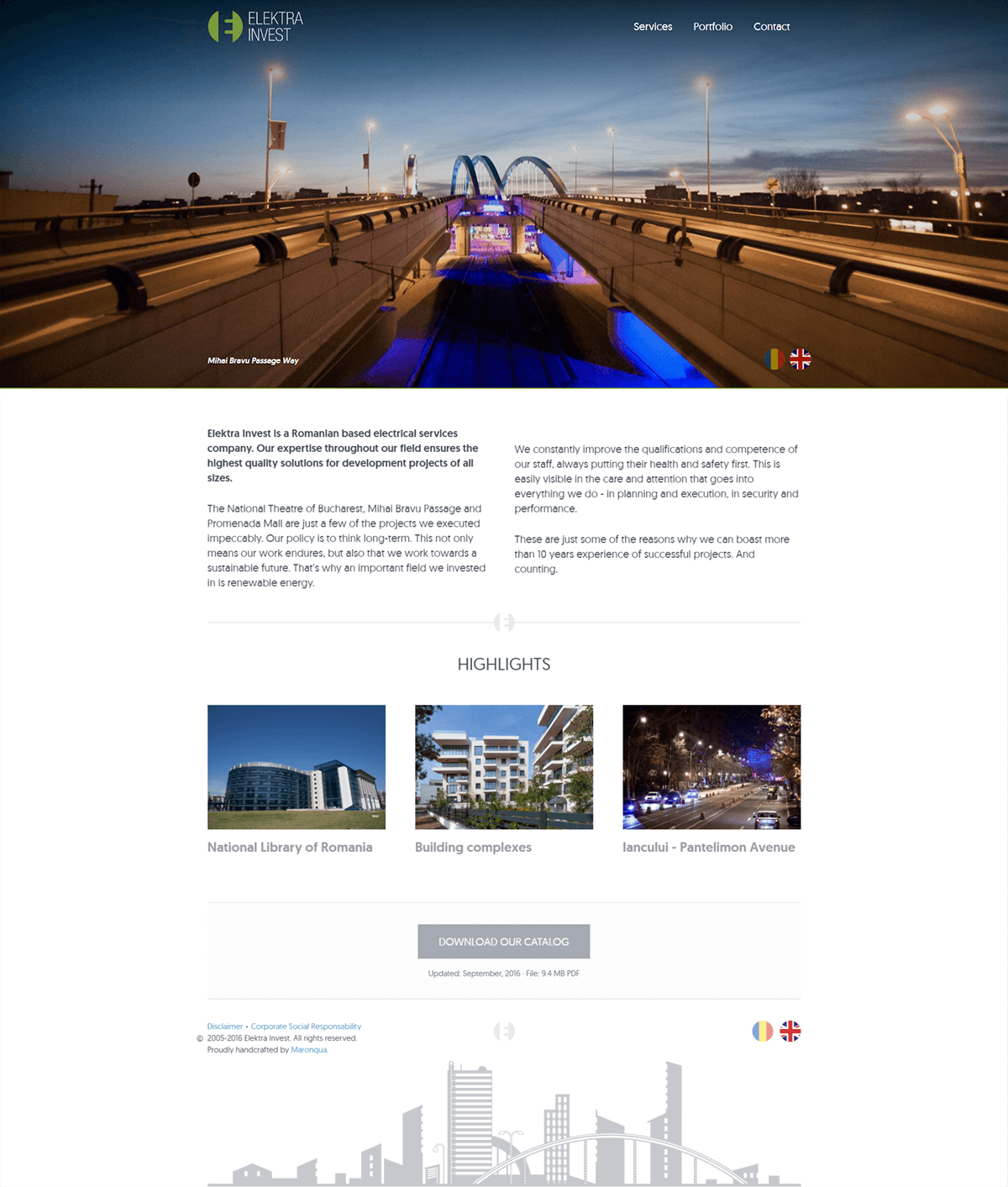
Elektra Invest is a Romanian electrical service company. They had made a name for themselves in a great variety of projects of all sizes. Moreover, they had recently started developing their green energy department. Being experts throughout their field, they needed a new brand image that reflected it. And then use it as a springboard for their on- and offline communication.
The basics
Simple, yet recognizable
We started with the basics: a complete overhaul of their brand image. Based on their brand identity and values we provided them with a simple, yet recognizable color scheme. Using it as a starting point, we then handcrafted their logo and service icons to be distinct and aligned with their brand.
Fieldwork
Crisp, pixel perfect assets
One of the primary needs of the company was to showcase their projects in a professional manner. As such, they needed to use crisp, Pixel Perfect assets. Enter our designer Bogdan, who faced dizzying heights, late nights and the occasional muddy field to get that perfect shot.
Handcrafting unity
Implement into an integrated solution
Having gathered and designed all of the necessary assets, it was time to implement them into an integrated solution. The photos support the portfolio. The custom icons reinforce the personalized copy. The logo proudly upholds the brand. Along with texts aligned to the brand's identity, these elements were harmoniously joined into website, catalogue and print materials.
Standing out in the crowd
As opposed to other websites in their field, we wanted to handcraft Elektra Invest's into a smooth experience. Navigation through the brand's assets needed to be as simple as possible. At the same time, it needed to showcase the brand's identity and strengths in a unique way.
A seamless online experience
We stripped the website of any unnecessary fluff and stuck to their strengths. Their services and portfolio took the spotlight and we made sure they were easy to access. Finally, we made the layout responsive, so it could adapt to any device. All to deliver a seamless online experience.


Elegant simplicity
The color palette was developed to support the brand in a subtle, but professional way. It creates the contrast needed for their assets to stand out and make an impact. For this reason we went for a very precise selection of shades.
Subtle, but professional
These shades provided the framework that upheld all of the content, be it illustration, photography or text. The color scheme therefore achieved visibility without intruding (which is exactly what it should do). The greens underline the brand's expansion into renewable energy, while they grays provide the undertone of their expertise and professionalism.