
Education Curb
Education Curb’s mission is to make learning fun. By disguising lessons as games, they deliver a pleasant experience to children and educate them on spelling at the same time. The app grabs their attention and holds it. However, their website and social media strategy needed a revamp. That’s where we came in.
A is for art
Create a journey
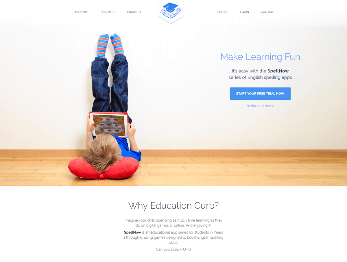
The website presented parents and teachers with the app and allowed them to purchase it. However, since it was very crowded and hard to peruse, it needed an overhaul, in terms of layout and UX. We used the existing design and texts as a foundation. Then we picked a more expressive font and polished everything else to create a journey and tell the brand’s story.
B is for business
Delivering value upfront to any visitor
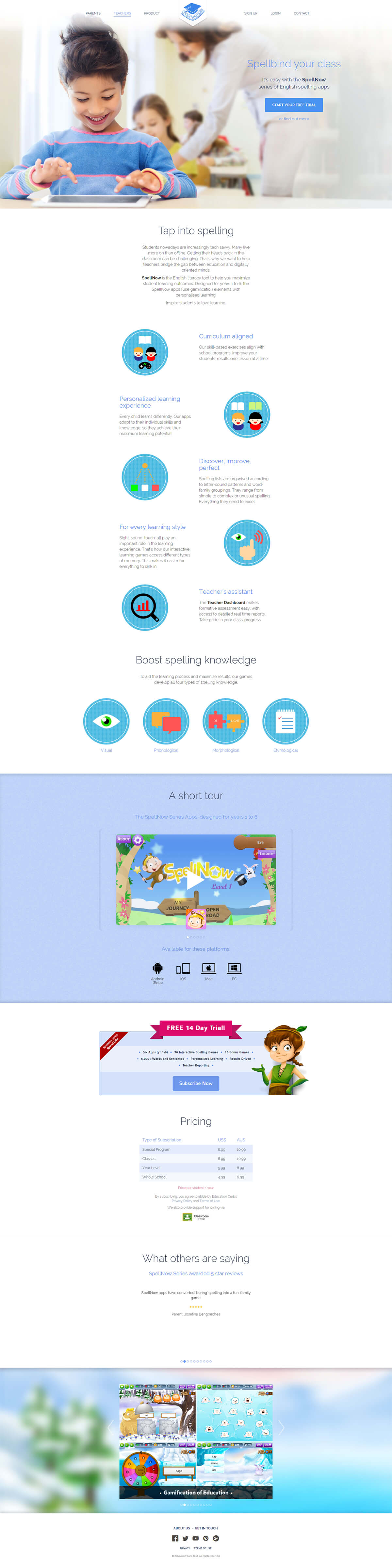
Reusing the existing iconography, created by their in-house designer Jessica, we offered visual support for the text. Long paragraphs were rewritten and aligned to the brand's new voice: delivering value upfront to any visitor. Moreover, specific terminology flavoured the texts for the two different target markets: parents and teachers.
C is for counsel
Using our broad experience
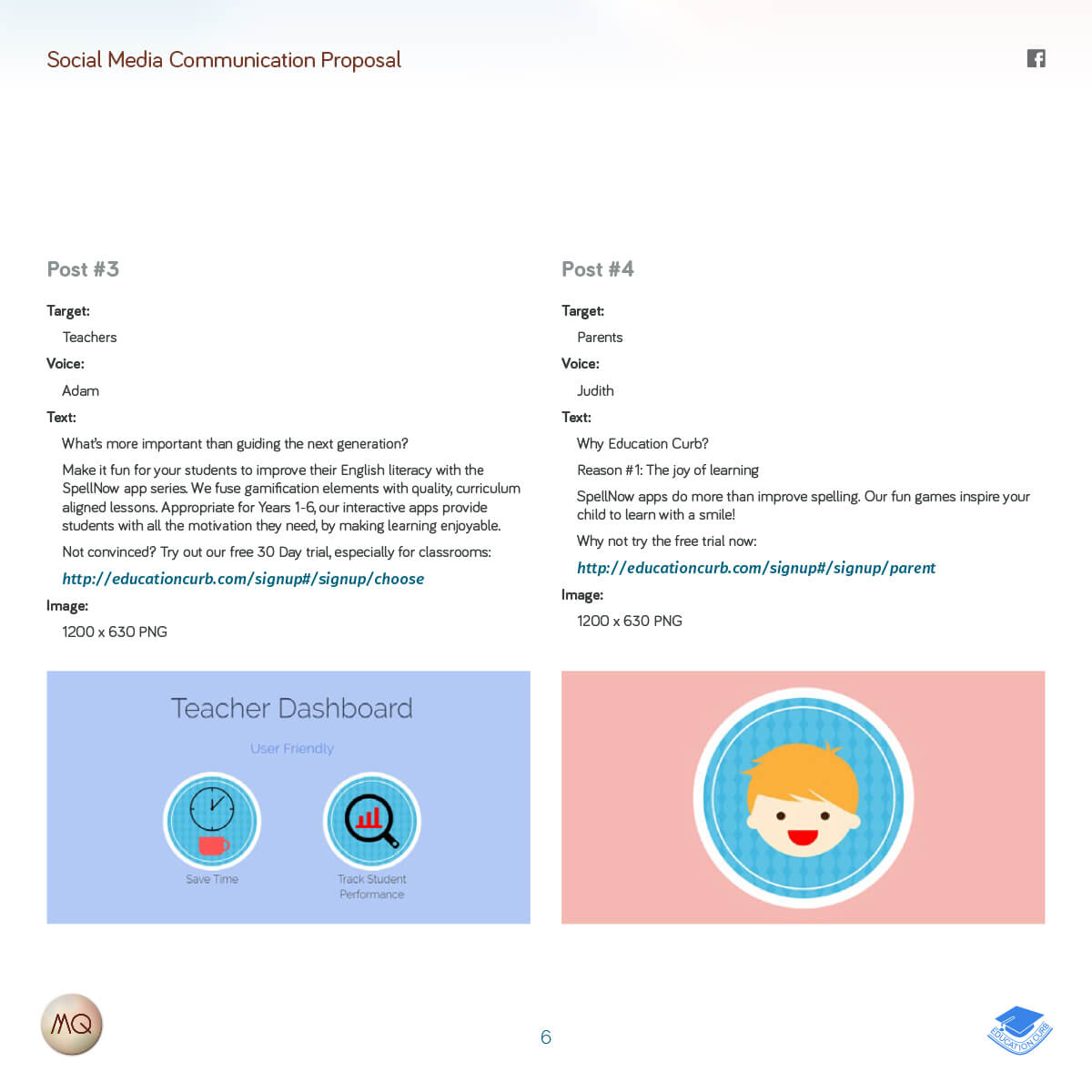
However, the project didn't only involve the website redesign. Our broad experience counselled the stakeholders on their marketing strategy. We advised them on how to raise their visibility in the App Store, Google Play Store and their online purchase page. Finally, we also offered them guidelines for Social Media marketing, including best practices for scheduling, artwork and texts.
Putting the ‘experience’ in UX
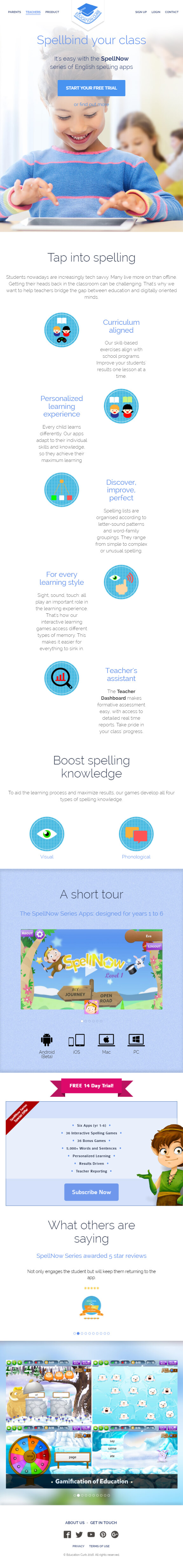
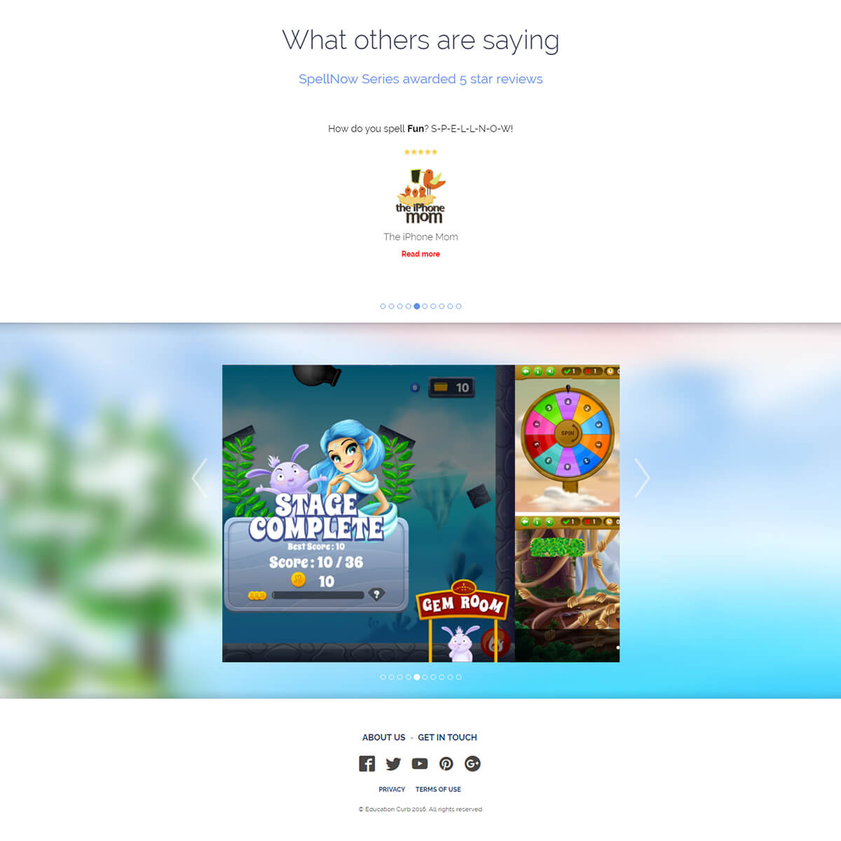
The website makes use of a complex array of media, from iconography to videos and in-app screenshots. To declutter it we made use of horizontal carousels for the app trailers, image gallery and testimonials. Video playback unfolds in a custom modal window.
A complex array of media
Although it contains a lot of elements, the layout we designed doesn’t take away from the experience, no matter how small the screen. From a UX standpoint, each one of those elements was integrated into the whole. Everything handcrafted into a consistent journey.
