
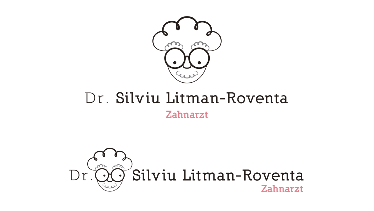
Dr. Silviu Litman-Rovența
Dr. Silviu Litman-Roventa’s dental practice needed an integrated brand image, to promote itself both on and offline. Apart from being a dentist, Dr. Litman-Roventa is an angel investor at Maronqua. This project gave us the opportunity to work with a business from abroad, thus expanding our reach. We decided to provide him with an integrated solution.
A Friendly Approach
A warm and friendly personality to guide our designs.
Silviu has a warm and friendly personality. Thanks to it, the patients who benefit the most are children - who would otherwise be afraid of the dentist. This would guide us in both design and attitude. Especially since our research revealed that most of the other brands in this field use similar colors, ideas and general aspects. The goal was to create a unique brand image that set him apart, but also communicated what he stands for and practices.
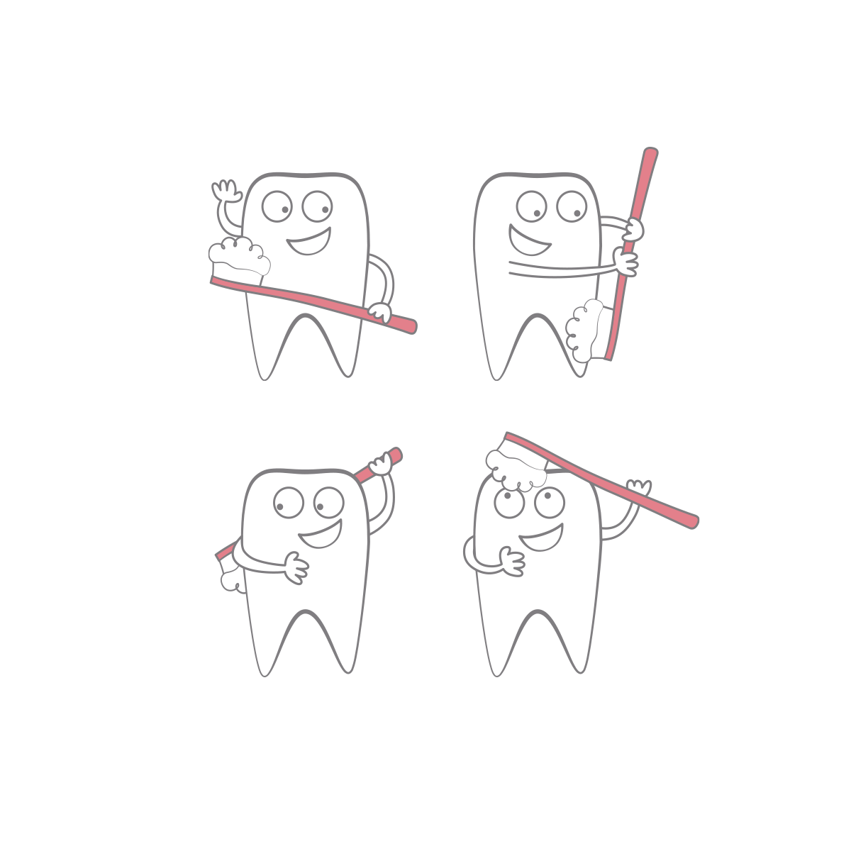
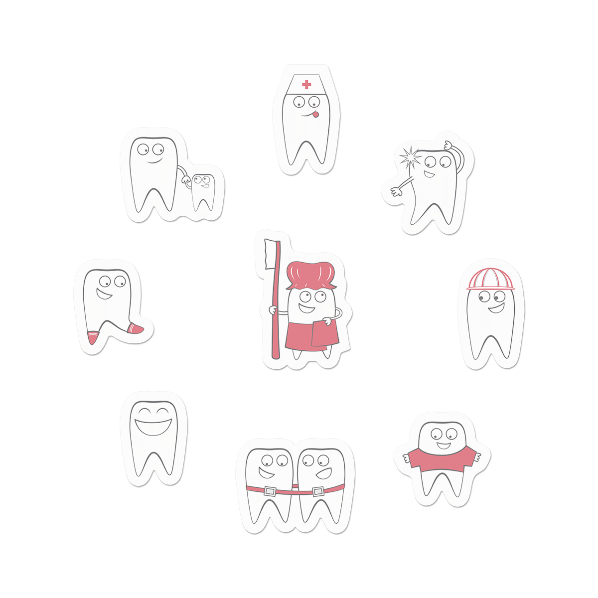
Toothy!
Putting the fun in dentistry!
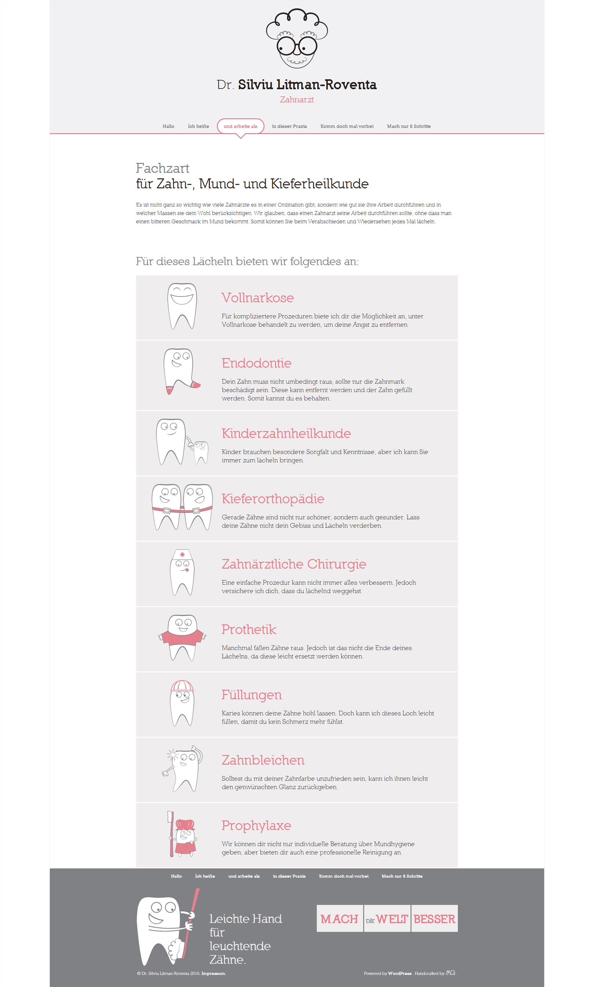
We proceeded to build a brand identity that would be perfectly aligned to this view, through everything that supported it. Silviu's charisma was reflected in the design of the new identity and its color scheme. This was the foundation from which every element flowed. Like Toothy, who was designed as the practice's mascot. He served as both educational and entertaining component for Silviu's favourite customers: children. Moreover, he communicated the brand's values and activity in a simple, pleasant and cheerful manner.
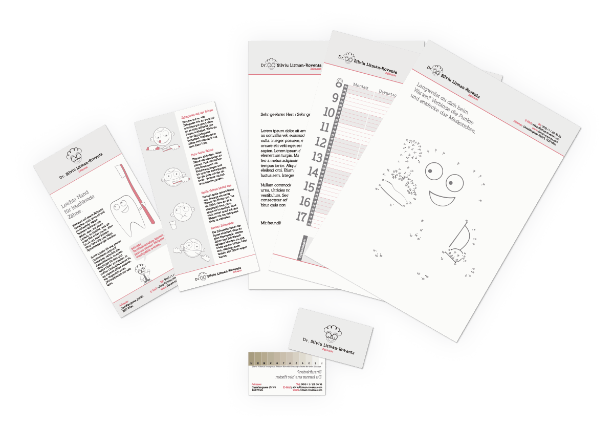
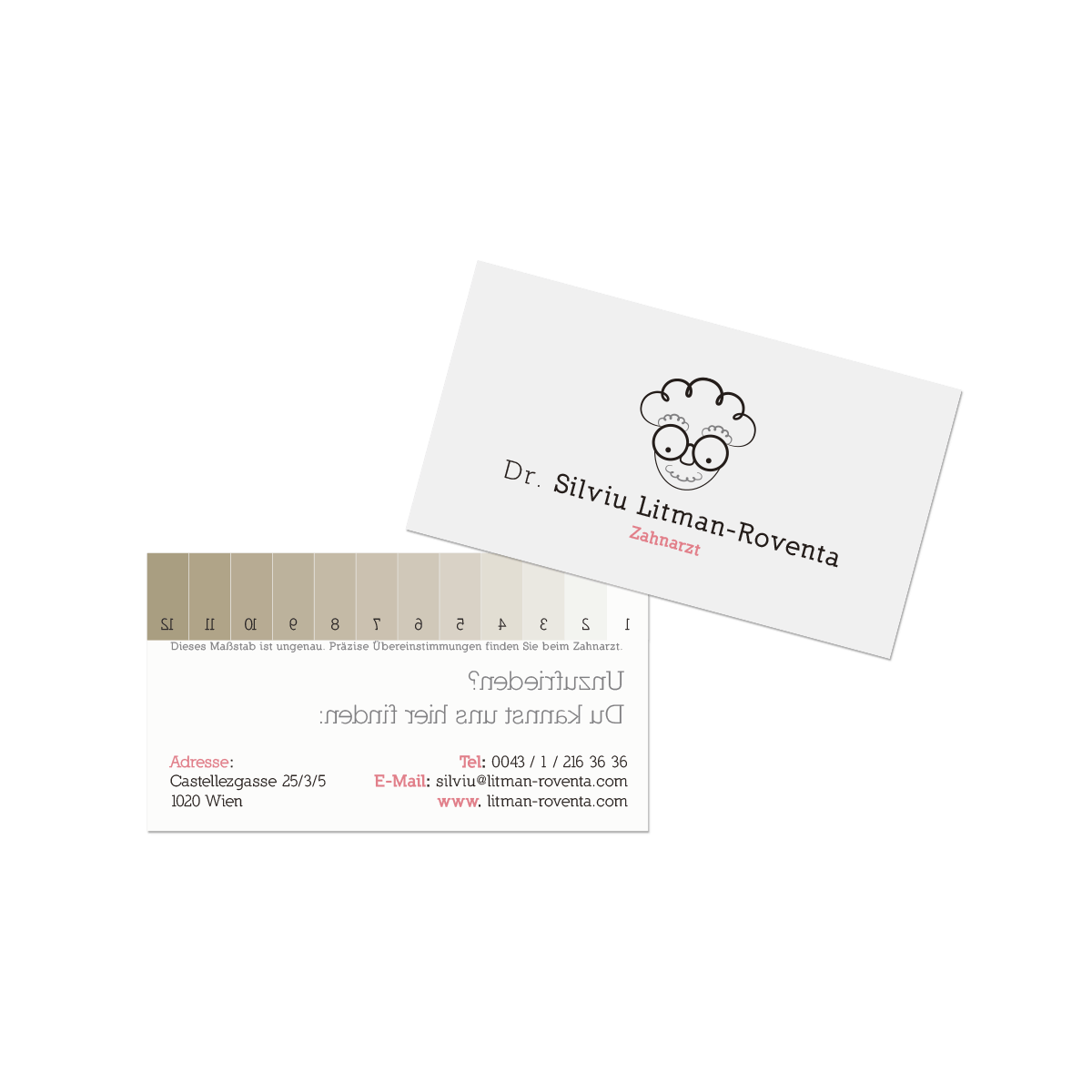
Leave a mark!
Conceived as an integral part of the whole.
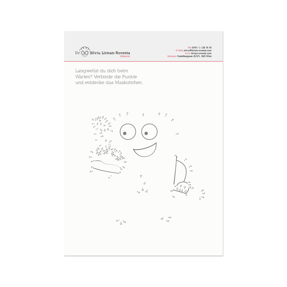
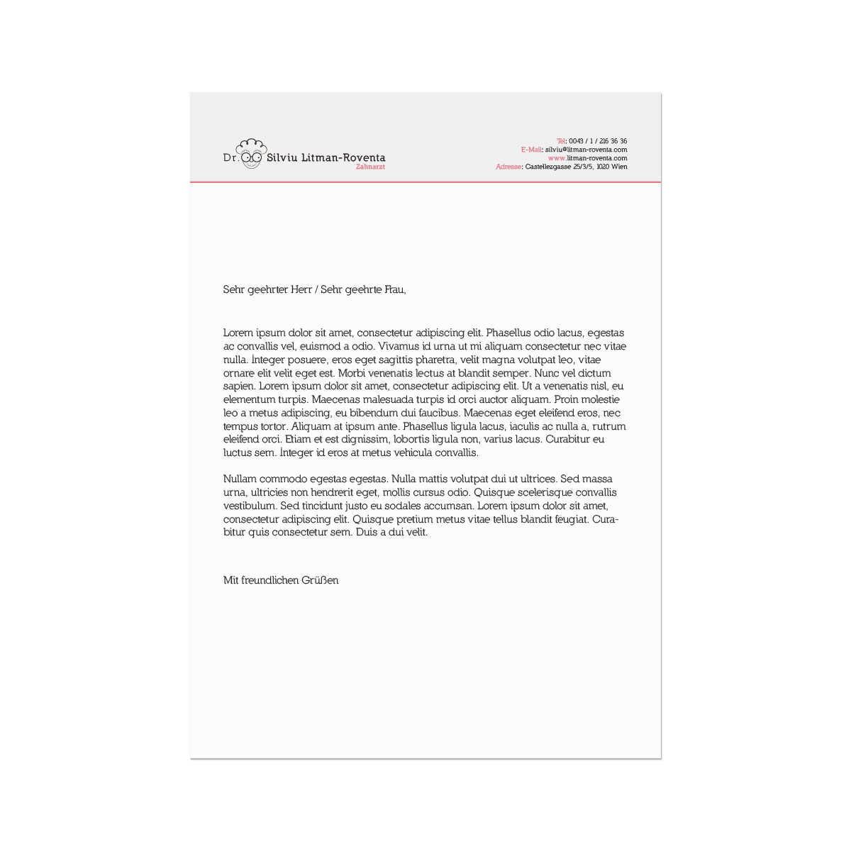
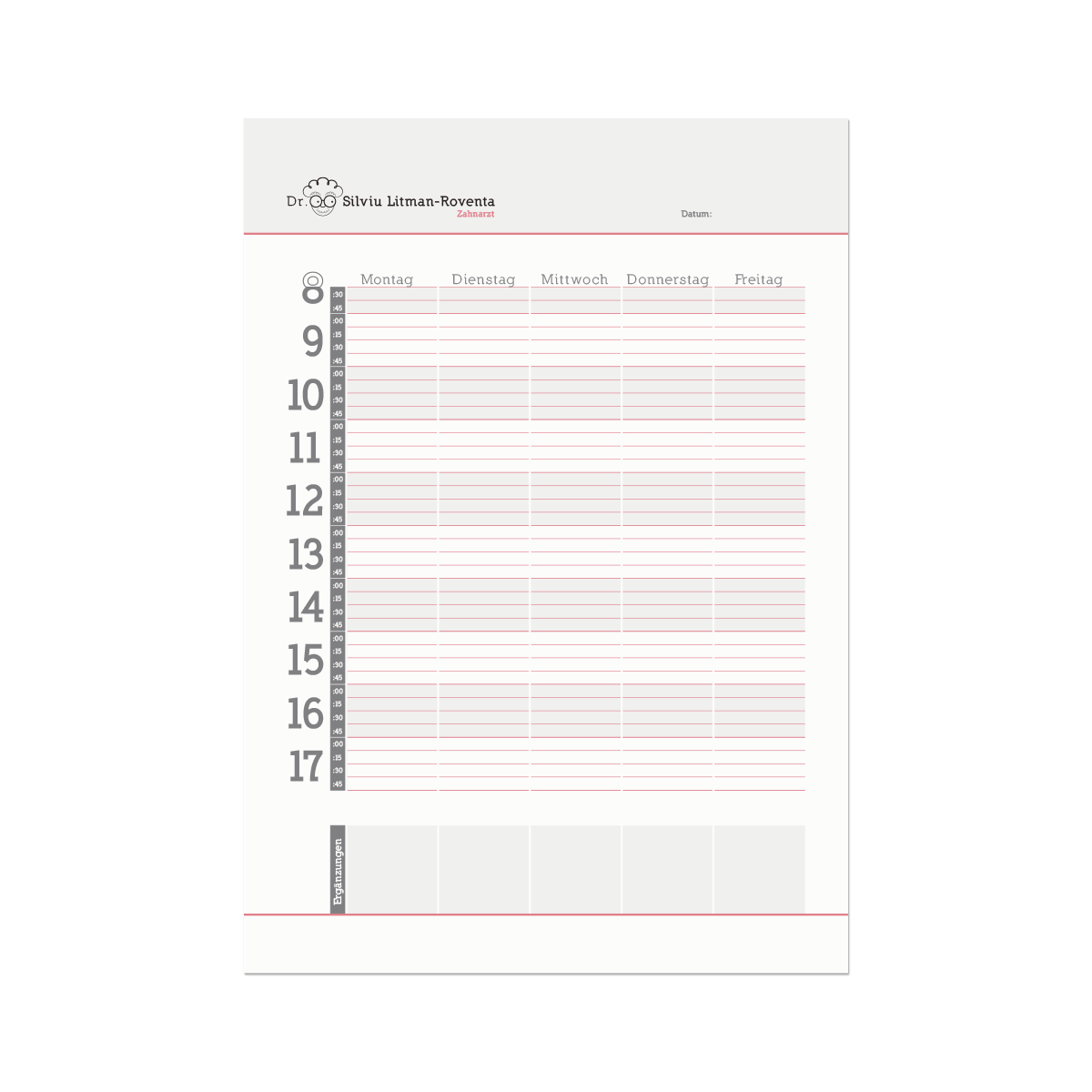
The color scheme, logo and illustrations we designed, became the foundation for both website and print materials. The latter needed to be quickly associated with the practice's new identity. To this end, we created a great variety of items, from business cards, to informational leaflets, calendars, stationery, waiting-room-boredom-remedies and even stickers. Each of them was conceived as an integral part of the whole.
Simple & functional: child's play!
The website and its elements were of course designed to fit the bigger picture. The online strategy was developed with the dental practice's patients in mind, in order to facilitate their access to its services. We wanted to make it an experience as pleasant as going to see Silviu himself.
Every page and every element carefully handcrafted to perfection.
As a result, the site is responsive across all devices (which is a Maronqua staple). We also ensured that it was child's play for any patient to book an appointment online, through a simple, specifically designed system.

Professional playfulness
A thorough research of dentist practices in Austria revealed that different brands used a similar image. Therefore, they all blended in, none really recognisable. We decided to make Silviu's brand identity unique and distinct, which meant distancing ourselves from the norm.
The simple yet recognisable color scheme we chose retains the professional and clean aspect of a dentist's office. However, to that it adds just the right amount of playfulness. Using them right meant that the brand communicated Silviu's charm, even on a chromatic level.